Figma | Notion

Out of Office
Out of Office is where my work lives beyond traditional structures. It brings together a range of freelance and part-time projects, from building brands from the ground up to visual identity, branding, rebranding, and UX/UI design.
It is a space for experimentation, close collaboration, and shared process often developed with people I know well yet always driven by the same level of rigor, care, and attention to detail. A place where the process matters as much as the final outcome.
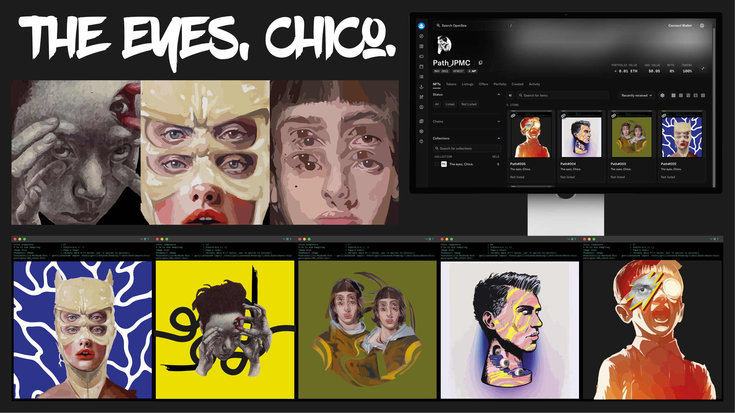
The Eyes, Chico. is an NFT collection created as an exploration of vision, consciousness, and identity in a digital context. The project emerged from a desire to enter and understand the NFT ecosystem and the OpenSea platform through an experimental, author-driven process.
The artworks were built using multiple vectorized layers, combining digital illustration and painting to create fragmented faces and expressive compositions. The eye acts as the central element, serving as a metaphor for perception, absorption, and the consumption of images in the digital age.
This project sits at the intersection of illustration, visual identity, and technology, functioning as a creative laboratory for experimenting with new forms of artistic creation and distribution.
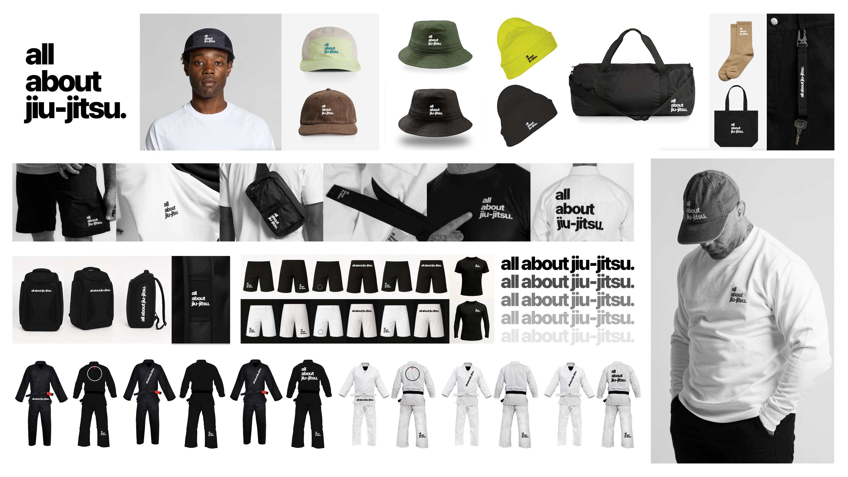
All About Jiu-Jitsu is a brand created from scratch with a singular focus on jiu-jitsu. While it shares conceptual roots with AOF, this project narrows its scope to celebrate the discipline, values, and accessibility of the art.
The goal was to demystify the idea that jiu-jitsu is only for a select group, highlighting it as a practice open to anyone. The brand elevates core principles such as respect, discipline, and humility, while acknowledging jiu-jitsu as a powerful form of self-defense.
The project involved the full development of the brand identity and visual language, spanning apparel design, training equipment, and communication assets for digital platforms and social media. Designed not only for athletes but for anyone drawn to the culture, All About Jiu-Jitsu positions itself at the intersection of sport, lifestyle, and contemporary design.
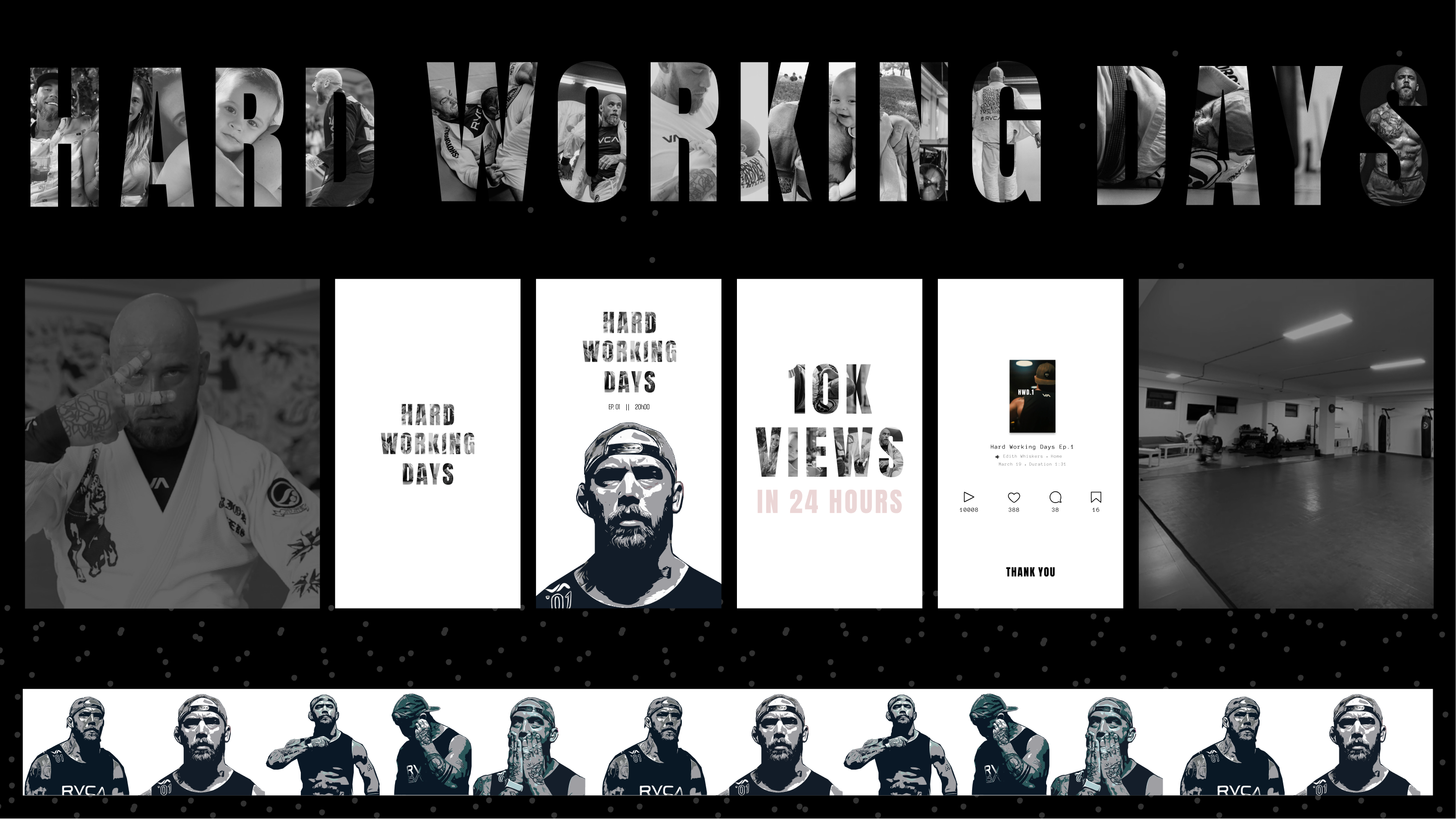
Hard Working Days was a documentary series released on Instagram, divided into multiple episodes that closely followed the daily life of an athlete. Throughout the series, the audience was invited to immerse themselves in his routine from family moments and intense training sessions to competition preparation and the challenges of managing his own gym.
The project offers an honest and inspiring portrait of dedication, discipline, and passion for sport, revealing that behind every victory lies consistent effort, sacrifice, and hard work.
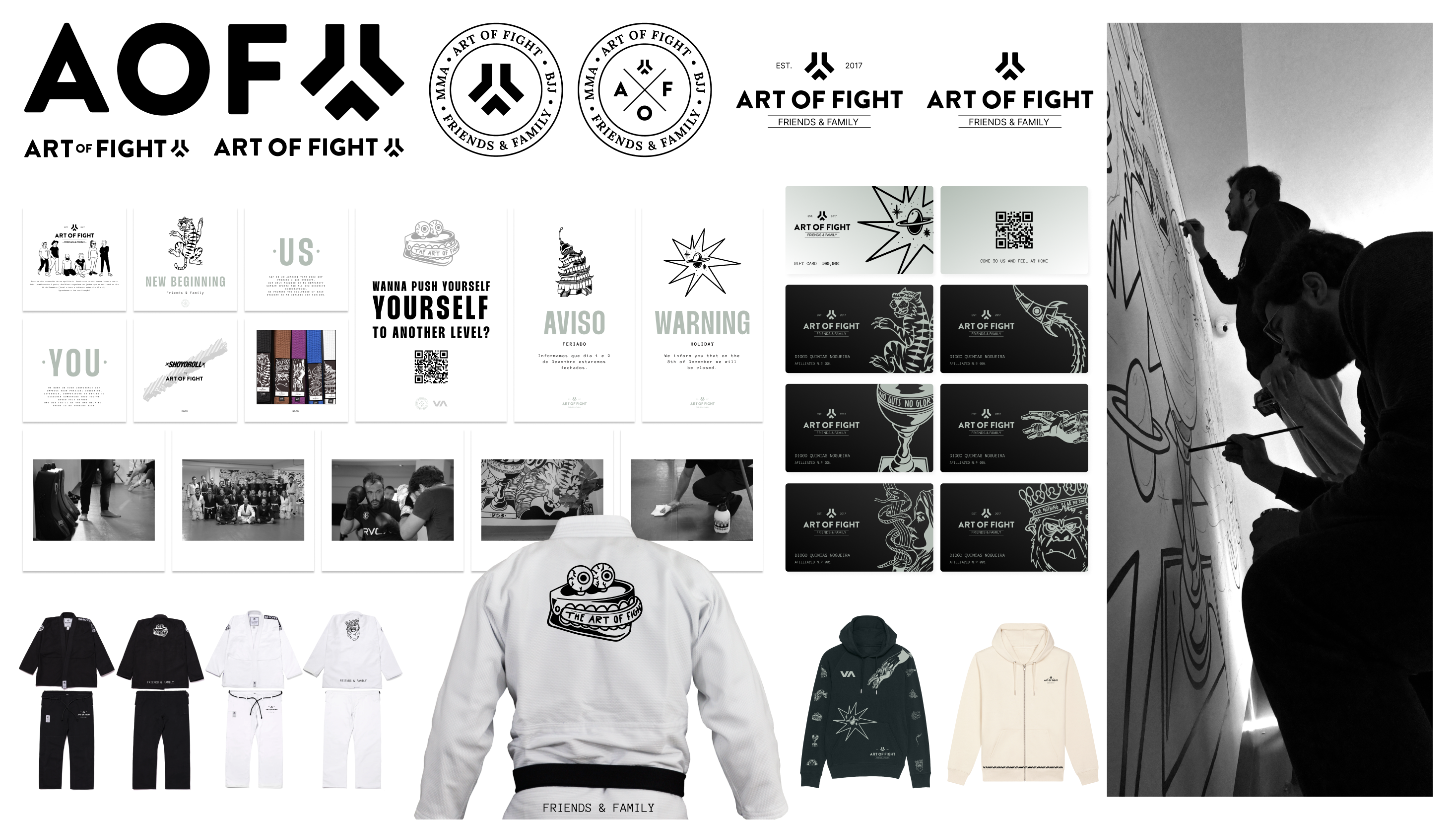
Art of Fight (AOF) was a branding project developed for a combat sports academy. The work focused on creating a strong and cohesive identity that reflects the discipline, values, and community behind the sport.
The project covered the full visual ecosystem of the brand, including visual identity, communication strategy, social media assets, training equipment, and lifestyle apparel. The graphic language blends raw, expressive elements with a clean and functional system, allowing the brand to translate seamlessly across digital and physical touchpoints.
AOF was designed to go beyond the academy space, positioning the brand as a lifestyle rooted in combat sports culture, discipline, and shared values.
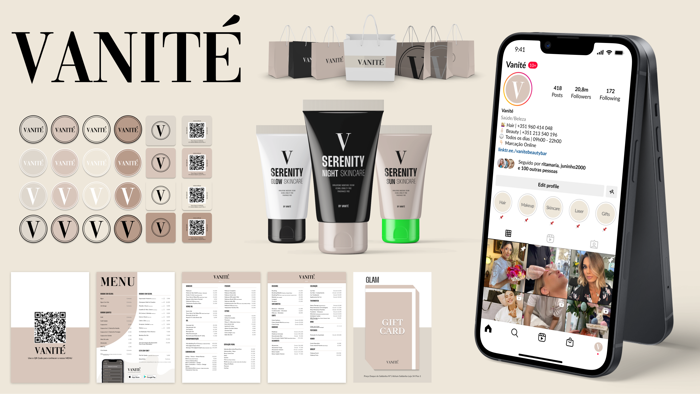
Vanité is a premium beauty and hair destination located in the heart of Lisbon (Saldanha). Positioned as an ultra premium self-care sanctuary, the brand required a visual identity that conveyed exclusivity, sophistication, and trust. The challenge was to translate this positioning into a timeless yet contemporary design system, delivering a seamless luxury experience across both physical and digital touchpoints.
The project evolved into a 360º brand experience, encompassing the core visual identity and extending to the development of a professional skincare line, Serenity, as well as bespoke merchandising. Key deliverables included an elegant and cohesive packaging system for cosmetic products, refined printed materials such as service menus and gift cards, and a curated social media presence.
Every design decision from the use of serif typography to the muted, earthy color palette—was carefully considered to reinforce Vanité’s positioning as a reference brand within the Portuguese luxury beauty market.
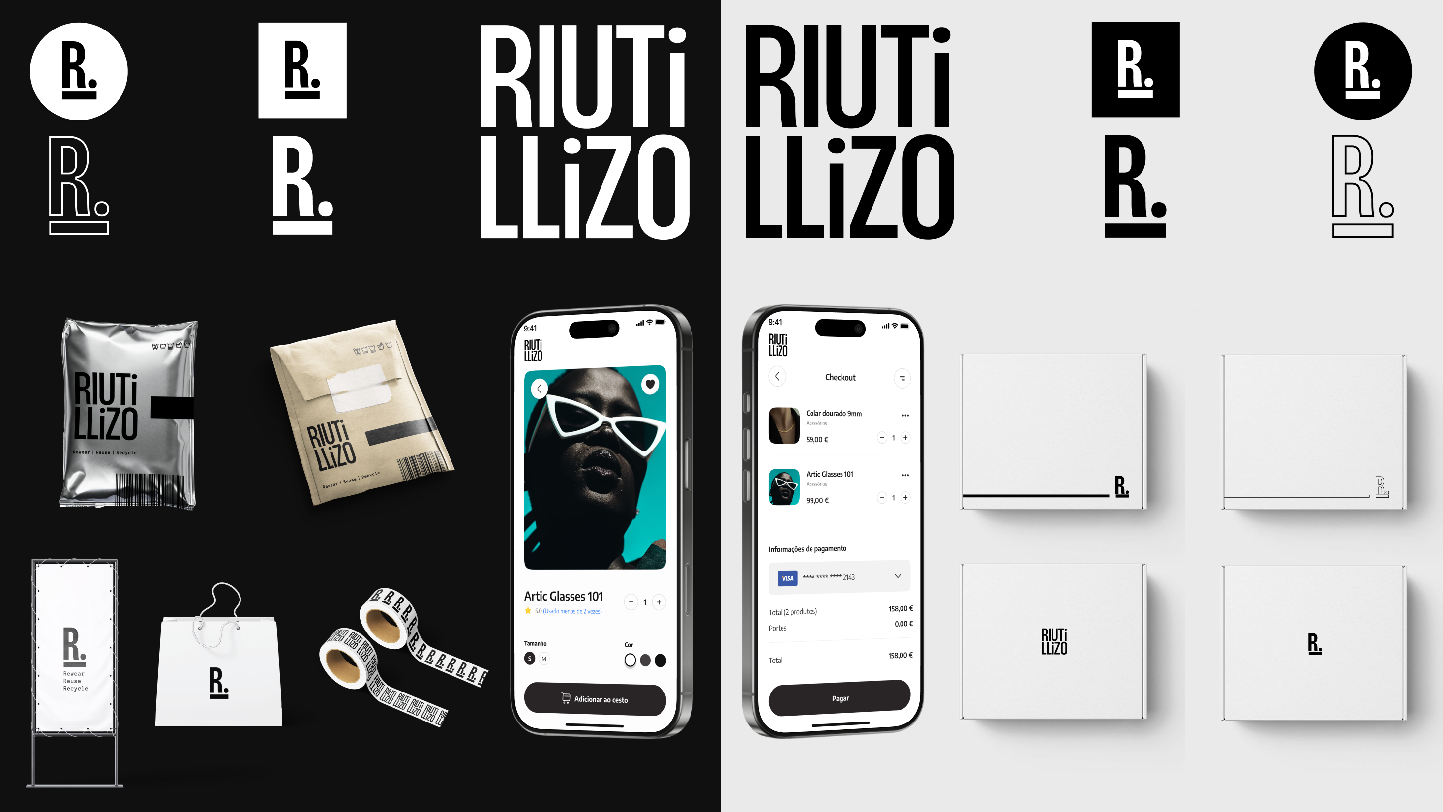
Riutilizzo is a sustainable fashion platform designed to bridge the gap between premium style and environmental responsibility. The project involved creating a cohesive brand ecosystem from a minimalist visual identity to a seamless digital shopping experience—dedicated to the circular economy. By offering a curated selection of pre-loved clothing, the brand redefines second-hand shopping as a sophisticated, conscious choice.
Design System & User Experience: The visual language relies on a high-contrast, monochrome palette to allow the textures and styles of the clothing to take center stage. I developed a flexible identity system that translates seamlessly from physical touchpoints such as eco-friendly packaging and retail signage to a mobile-first digital interface. The UI was designed with a focus on clarity and "frictionless" navigation, ensuring that the commitment to sustainability is reflected in a clean, modern, and high-end user journey.
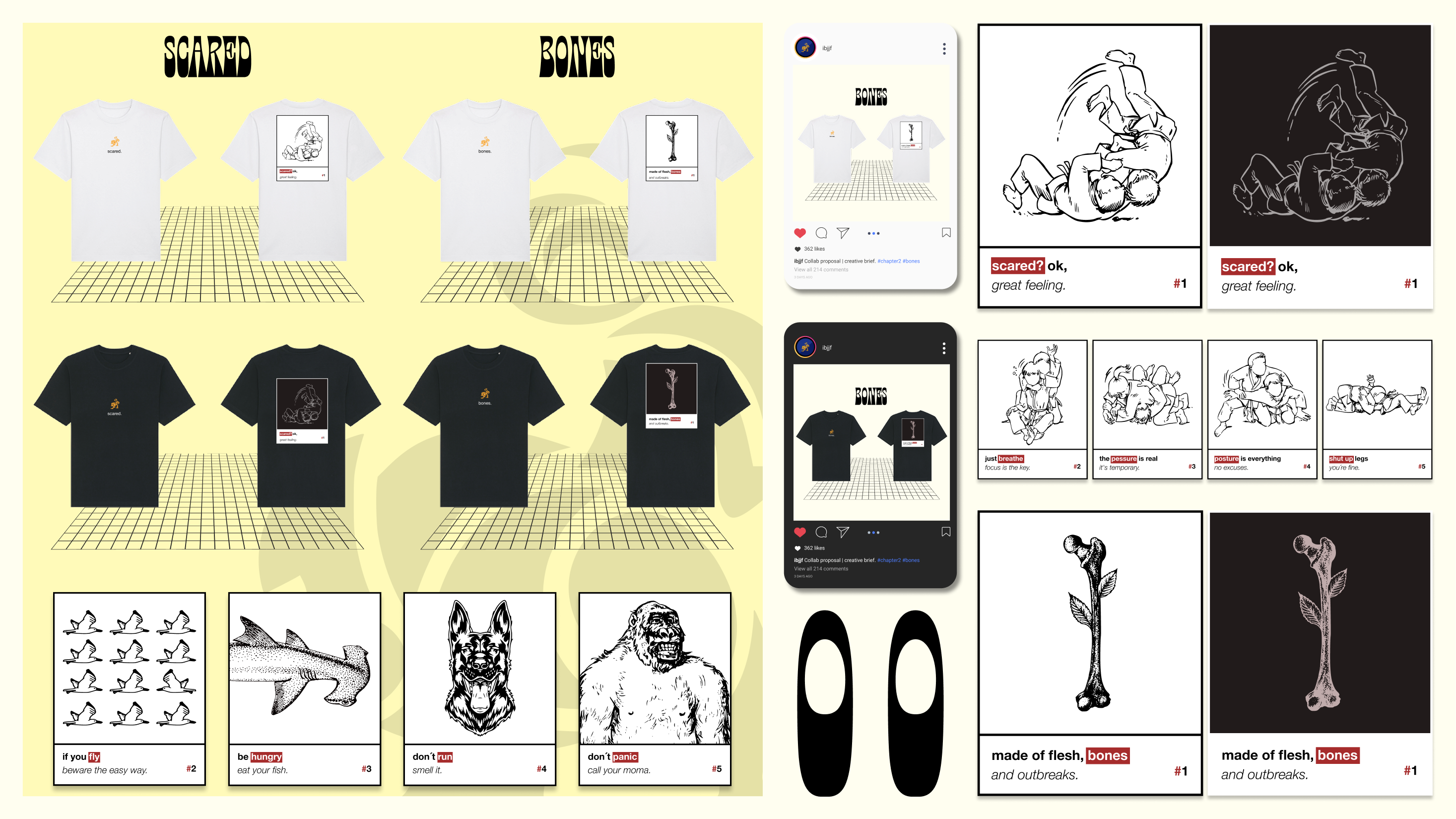
Each piece was carefully crafted, blending contemporary graphic elements with references to the roots of jiu-jitsu. The goal is to offer practitioners an authentic way to express their identity and their connection to the art.
The project is divided into two chapters. Chapter One focuses on techniques that are widely practiced by jiu-jitsu athletes. Chapter Two explores a more eccentric artistic approach, incorporating subliminal messages and conceptual elements.
Across both chapters, the back of each t-shirt features a highlighted “square box” message that connects directly to the artwork above. The front showcases the IBJJF logo alongside the previously highlighted word, reinforcing the visual and conceptual link between both sides of the garment.
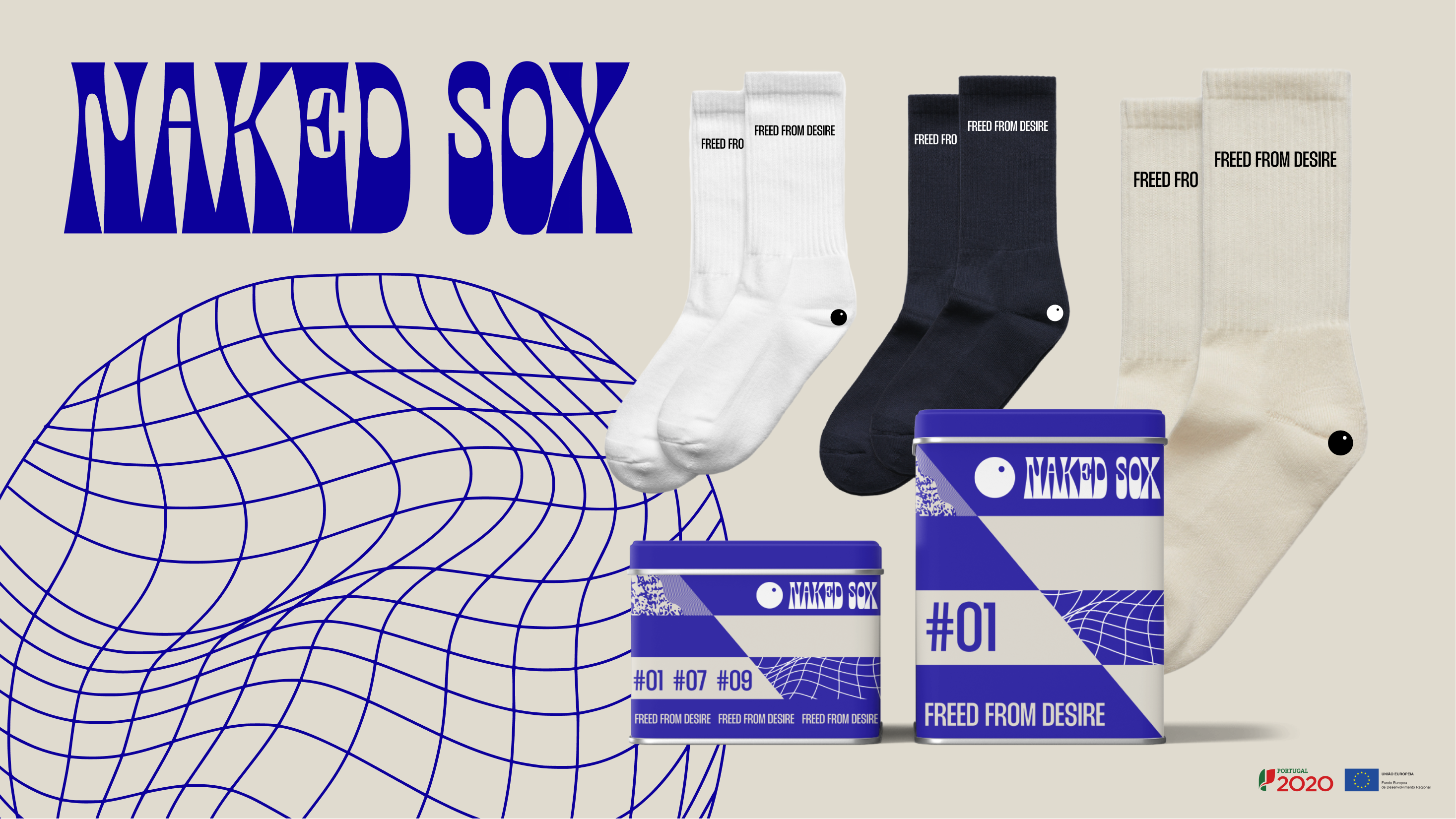
Naked Sox is a project born at the intersection of textile essentialism and urban culture. My role involved the complete development of the brand identity and product design, transforming high-performance socks into a medium for self-expression through bold graphic punchlines and a digital-brutalist aesthetic.
Sustainability & Circular Packaging: Beyond the textile design, a core focus was placed on circularity and long-term utility. Moving away from conventional disposable plastic packaging, I developed a premium metal tin solution designed to be both collectible and reusable.
This approach not only elevates the unboxing experience and brand prestige but also significantly reduces waste, ensuring the packaging serves a secondary purpose in the user’s home long after the initial purchase.

Figma | Notion
Out of Office
Out of Office is where my work lives beyond traditional structures. It brings together a range of freelance and part-time projects, from building brands from the ground up to visual identity, branding, rebranding, and UX/UI design.
It is a space for experimentation, close collaboration, and shared process often developed with people I know well yet always driven by the same level of rigor, care, and attention to detail. A place where the process matters as much as the final outcome.
The Eyes, Chico. is an NFT collection created as an exploration of vision, consciousness, and identity in a digital context. The project emerged from a desire to enter and understand the NFT ecosystem and the OpenSea platform through an experimental, author-driven process.
The artworks were built using multiple vectorized layers, combining digital illustration and painting to create fragmented faces and expressive compositions. The eye acts as the central element, serving as a metaphor for perception, absorption, and the consumption of images in the digital age.
This project sits at the intersection of illustration, visual identity, and technology, functioning as a creative laboratory for experimenting with new forms of artistic creation and distribution.
All About Jiu-Jitsu is a brand created from scratch with a singular focus on jiu-jitsu. While it shares conceptual roots with AOF, this project narrows its scope to celebrate the discipline, values, and accessibility of the art.
The goal was to demystify the idea that jiu-jitsu is only for a select group, highlighting it as a practice open to anyone. The brand elevates core principles such as respect, discipline, and humility, while acknowledging jiu-jitsu as a powerful form of self-defense.
The project involved the full development of the brand identity and visual language, spanning apparel design, training equipment, and communication assets for digital platforms and social media. Designed not only for athletes but for anyone drawn to the culture, All About Jiu-Jitsu positions itself at the intersection of sport, lifestyle, and contemporary design.
Hard Working Days was a documentary series released on Instagram, divided into multiple episodes that closely followed the daily life of an athlete. Throughout the series, the audience was invited to immerse themselves in his routine from family moments and intense training sessions to competition preparation and the challenges of managing his own gym.
The project offers an honest and inspiring portrait of dedication, discipline, and passion for sport, revealing that behind every victory lies consistent effort, sacrifice, and hard work.
Art of Fight (AOF) was a branding project developed for a combat sports academy. The work focused on creating a strong and cohesive identity that reflects the discipline, values, and community behind the sport.
The project covered the full visual ecosystem of the brand, including visual identity, communication strategy, social media assets, training equipment, and lifestyle apparel. The graphic language blends raw, expressive elements with a clean and functional system, allowing the brand to translate seamlessly across digital and physical touchpoints.
AOF was designed to go beyond the academy space, positioning the brand as a lifestyle rooted in combat sports culture, discipline, and shared values.
Vanité is a premium beauty and hair destination located in the heart of Lisbon (Saldanha). Positioned as an ultra premium self-care sanctuary, the brand required a visual identity that conveyed exclusivity, sophistication, and trust. The challenge was to translate this positioning into a timeless yet contemporary design system, delivering a seamless luxury experience across both physical and digital touchpoints.
The project evolved into a 360º brand experience, encompassing the core visual identity and extending to the development of a professional skincare line, Serenity, as well as bespoke merchandising. Key deliverables included an elegant and cohesive packaging system for cosmetic products, refined printed materials such as service menus and gift cards, and a curated social media presence.
Every design decision from the use of serif typography to the muted, earthy color palette—was carefully considered to reinforce Vanité’s positioning as a reference brand within the Portuguese luxury beauty market.
Riutilizzo is a sustainable fashion platform designed to bridge the gap between premium style and environmental responsibility. The project involved creating a cohesive brand ecosystem from a minimalist visual identity to a seamless digital shopping experience—dedicated to the circular economy. By offering a curated selection of pre-loved clothing, the brand redefines second-hand shopping as a sophisticated, conscious choice.
Design System & User Experience: The visual language relies on a high-contrast, monochrome palette to allow the textures and styles of the clothing to take center stage. I developed a flexible identity system that translates seamlessly from physical touchpoints such as eco-friendly packaging and retail signage to a mobile-first digital interface. The UI was designed with a focus on clarity and "frictionless" navigation, ensuring that the commitment to sustainability is reflected in a clean, modern, and high-end user journey.
Each piece was carefully crafted, blending contemporary graphic elements with references to the roots of jiu-jitsu. The goal is to offer practitioners an authentic way to express their identity and their connection to the art.
The project is divided into two chapters. Chapter One focuses on techniques that are widely practiced by jiu-jitsu athletes. Chapter Two explores a more eccentric artistic approach, incorporating subliminal messages and conceptual elements.
Across both chapters, the back of each t-shirt features a highlighted “square box” message that connects directly to the artwork above. The front showcases the IBJJF logo alongside the previously highlighted word, reinforcing the visual and conceptual link between both sides of the garment.
Naked Sox is a project born at the intersection of textile essentialism and urban culture. My role involved the complete development of the brand identity and product design, transforming high-performance socks into a medium for self-expression through bold graphic punchlines and a digital-brutalist aesthetic.
Sustainability & Circular Packaging: Beyond the textile design, a core focus was placed on circularity and long-term utility. Moving away from conventional disposable plastic packaging, I developed a premium metal tin solution designed to be both collectible and reusable.
This approach not only elevates the unboxing experience and brand prestige but also significantly reduces waste, ensuring the packaging serves a secondary purpose in the user’s home long after the initial purchase.