Outsystems | Figma | Jira

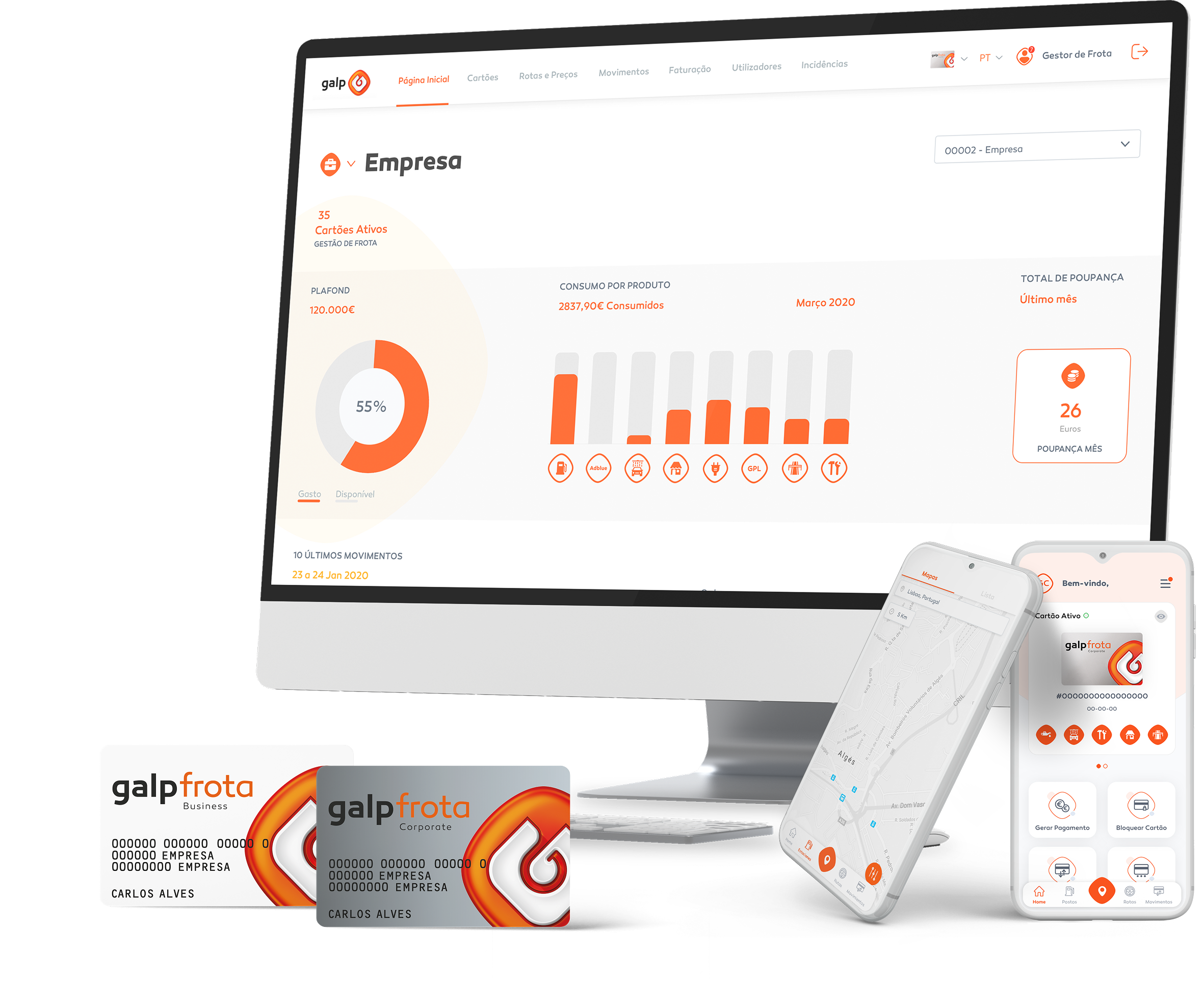
Galp frota
Galp Frota is Galp’s solution for managing company fleets and vehicle fueling. It combines payment and discount cards with digital tools to control consumption, costs, and fleet-related services.
Designed for companies with their own vehicles, it provides a centralized payment method card or digital for refueling, electric vehicle charging, tolls, and other automotive services (car wash, parking, etc.) across a wide network of service stations and charging points.
G
The Goal
Redesigned the app to enhance the end-user experience, prioritizing clarity, control, and efficiency in managing consumption and mobility services. The goal was to create an intuitive, reliable tool that supports quick decision-making and minimizes friction in everyday tasks.
P
The Problem
The user experience was overly complex, with excessive information, unintuitive flows, and a visual hierarchy that made it hard to quickly read key data. For users who need to act fast, this complexity increased cognitive load, caused errors, and reduced the perceived value of the application.
I
Initial Approach
We analyzed the real-world context of app usage, identifying key user profiles, their critical tasks, and the moments that caused the most frustration. Key journeys and flows were mapped, and essential information was identified.
The navigation structure and content hierarchy were then evaluated.
S
The Solution
Key design decisions focused on simplifying flows, establishing a clear visual hierarchy, and creating cleaner, more readable interfaces. The result is an app that reduces user effort, boosts confidence in fleet management, and positions the product as a modern, user-centric digital solution.
Card Management Flow
This flow covers the fleet card management and cancellation process, from overview to action confirmation, with a focus on control, security, and clear user feedback.
Users start in the Card Management area, where a structured list provides essential information for each card—number, holder, account, status, and available actions. Filters at the top allow quick searches, making the process efficient even for large fleets.
Selecting a card expands inline details, avoiding unnecessary navigation to other pages. This lets users access additional information and key actions contextually, while always maintaining awareness of their location in the system.
When a user chooses to cancel a card, a confirmation popup reinforces the security of the action. Upon confirmation, the system immediately provides feedback through a success message, and the card status is updated in the interface, ensuring consistency between the action taken and the information displayed.
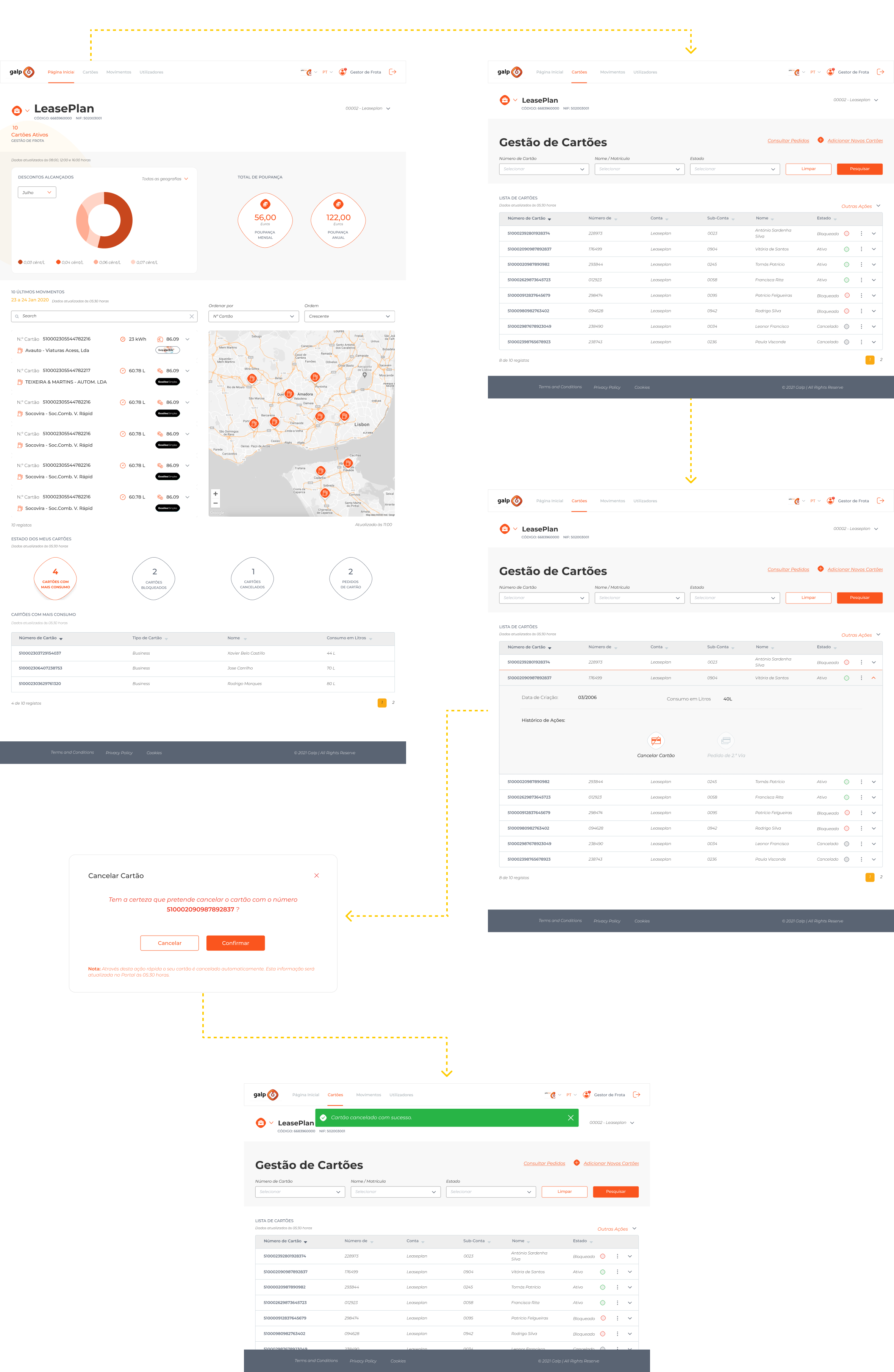
UI Decisions
The design relies on a strong visual hierarchy that emphasizes states, key actions, and critical information, making reading and decision-making easier. Inline card expansions reduce the need for additional navigation, keeping context always visible to the user.
Actions are contextual and displayed only when relevant, minimizing visual noise and improving efficiency. Irreversible actions trigger a confirmation popup, reinforcing security and user confidence.
Persistent visual feedback, such as success messages, provides immediate validation of completed actions. Consistent use of colors, icons, and spacing further enhances readability and delivers a clear, coherent experience.
Impact
The new workflow has greatly reduced friction in card management, making critical tasks faster, safer, and more predictable. Users now enjoy greater confidence, fewer errors, and a clearer sense of control over the fleet.
The final experience positions Galp Frota as a mature, efficient tool that meets managers’ real needs, reinforcing both the product’s value and trust in the brand.
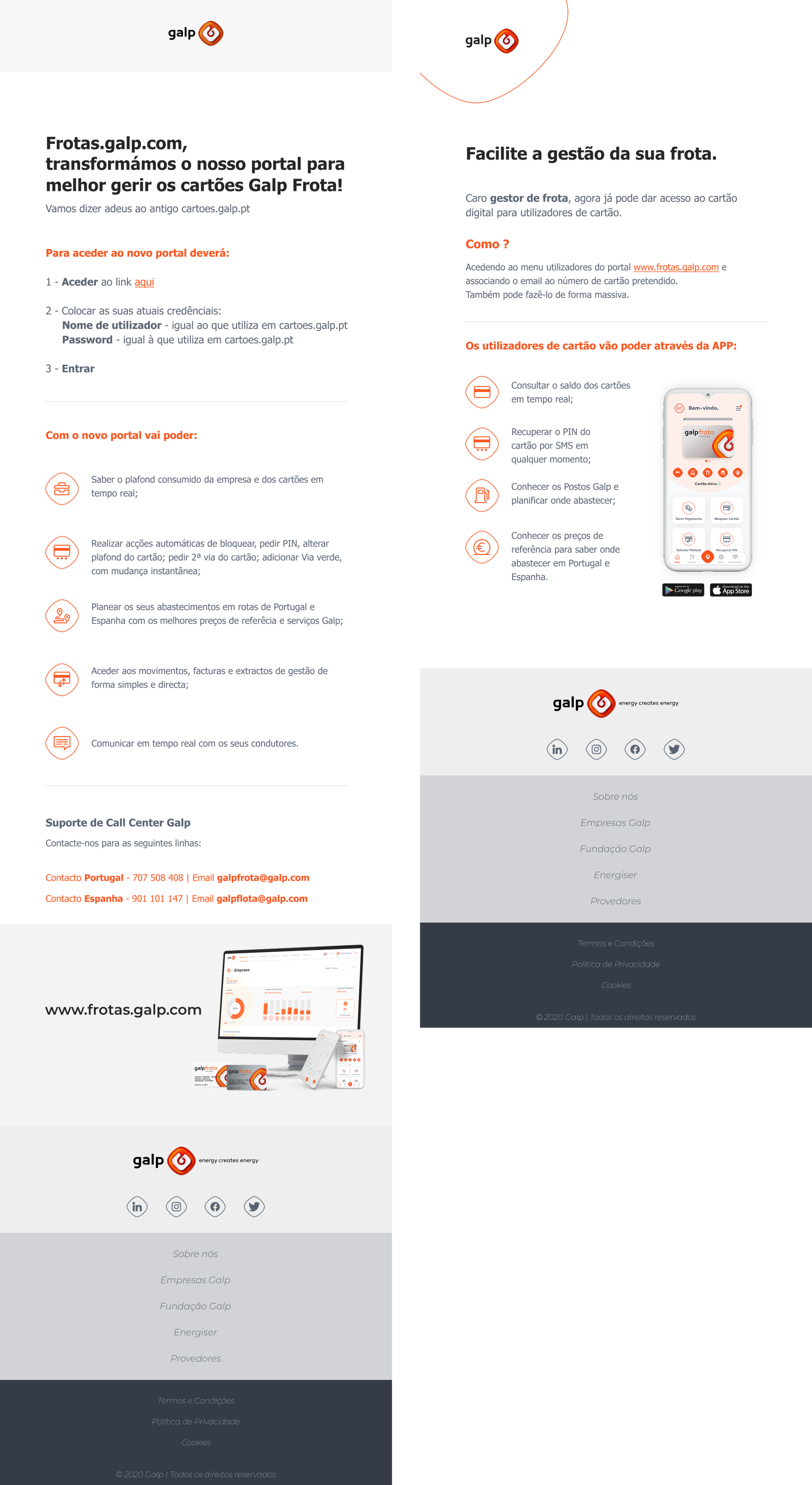
E-mail Push
Outsystems | Figma | Jira
Galp frota
Galp Frota is Galp’s solution for managing company fleets and vehicle fueling. It combines payment and discount cards with digital tools to control consumption, costs, and fleet-related services.
Designed for companies with their own vehicles, it provides a centralized payment method card or digital for refueling, electric vehicle charging, tolls, and other automotive services (car wash, parking, etc.) across a wide network of service stations and charging points.
G
The Goal
Redesigned the app to enhance the end-user experience, prioritizing clarity, control, and efficiency in managing consumption and mobility services. The goal was to create an intuitive, reliable tool that supports quick decision-making and minimizes friction in everyday tasks.
P
The Problem
The user experience was overly complex, with excessive information, unintuitive flows, and a visual hierarchy that made it hard to quickly read key data. For users who need to act fast, this complexity increased cognitive load, caused errors, and reduced the perceived value of the application.
I
Initial Approach
We analyzed the real-world context of app usage, identifying key user profiles, their critical tasks, and the moments that caused the most frustration. Key journeys and flows were mapped, and essential information was identified.
The navigation structure and content hierarchy were then evaluated.
S
The Solution
Key design decisions focused on simplifying flows, establishing a clear visual hierarchy, and creating cleaner, more readable interfaces. The result is an app that reduces user effort, boosts confidence in fleet management, and positions the product as a modern, user-centric digital solution.
Card Management Flow
This flow covers the fleet card management and cancellation process, from overview to action confirmation, with a focus on control, security, and clear user feedback.
Users start in the Card Management area, where a structured list provides essential information for each card—number, holder, account, status, and available actions. Filters at the top allow quick searches, making the process efficient even for large fleets.
Selecting a card expands inline details, avoiding unnecessary navigation to other pages. This lets users access additional information and key actions contextually, while always maintaining awareness of their location in the system.
When a user chooses to cancel a card, a confirmation popup reinforces the security of the action. Upon confirmation, the system immediately provides feedback through a success message, and the card status is updated in the interface, ensuring consistency between the action taken and the information displayed.
UI Decisions
The design relies on a strong visual hierarchy that emphasizes states, key actions, and critical information, making reading and decision-making easier. Inline card expansions reduce the need for additional navigation, keeping context always visible to the user.
Actions are contextual and displayed only when relevant, minimizing visual noise and improving efficiency. Irreversible actions trigger a confirmation popup, reinforcing security and user confidence.
Persistent visual feedback, such as success messages, provides immediate validation of completed actions. Consistent use of colors, icons, and spacing further enhances readability and delivers a clear, coherent experience.
Impact
The new workflow has greatly reduced friction in card management, making critical tasks faster, safer, and more predictable. Users now enjoy greater confidence, fewer errors, and a clearer sense of control over the fleet.
The final experience positions Galp Frota as a mature, efficient tool that meets managers’ real needs, reinforcing both the product’s value and trust in the brand.
E-mail Push