React | Figma | Azure DevOps Server

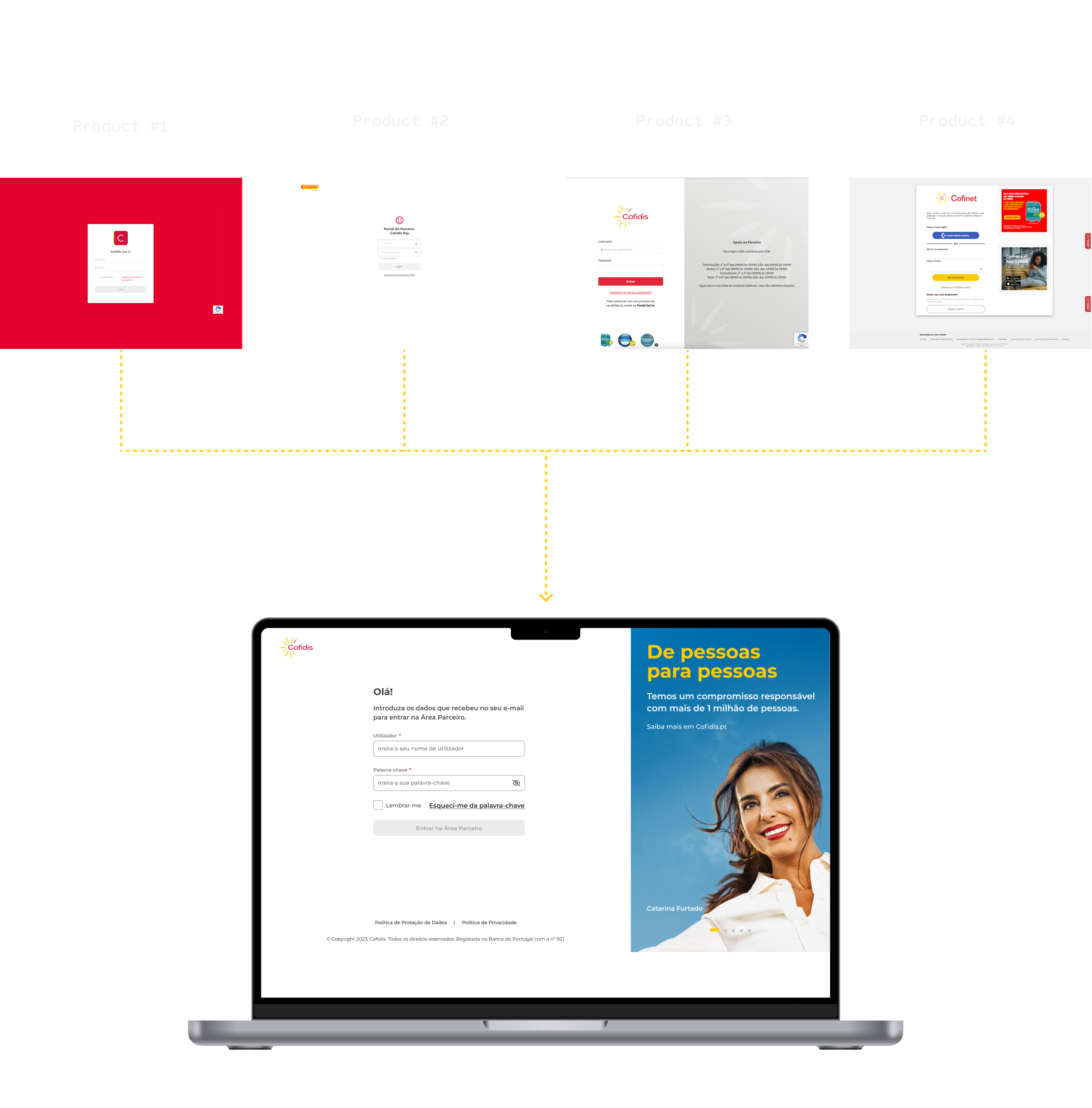
Área Parceiro 360
I joined Cofidis with the mission of contributing to one of the brand’s largest projects: Área Parceiro 360. This product is part of the B2B digital ecosystem, designed to streamline and optimize interactions with our partners.
Área Parceiro 360 brings together multiple products, resources, and content in a single platform, aiming to enhance the user experience, increase partner autonomy, and boost internal efficiency.
G
The Goal
Centralizing multiple products into a single platform, bringing features and content together in one place to improve user experience, increase partner autonomy, and boost internal efficiency.
P
The Problem
Information was confusing and scattered, with a high risk of errors in irreversible actions. Micro-actions were impossible to support due to differing rules and manual processes that relied on human validation.
I
Initial Approach
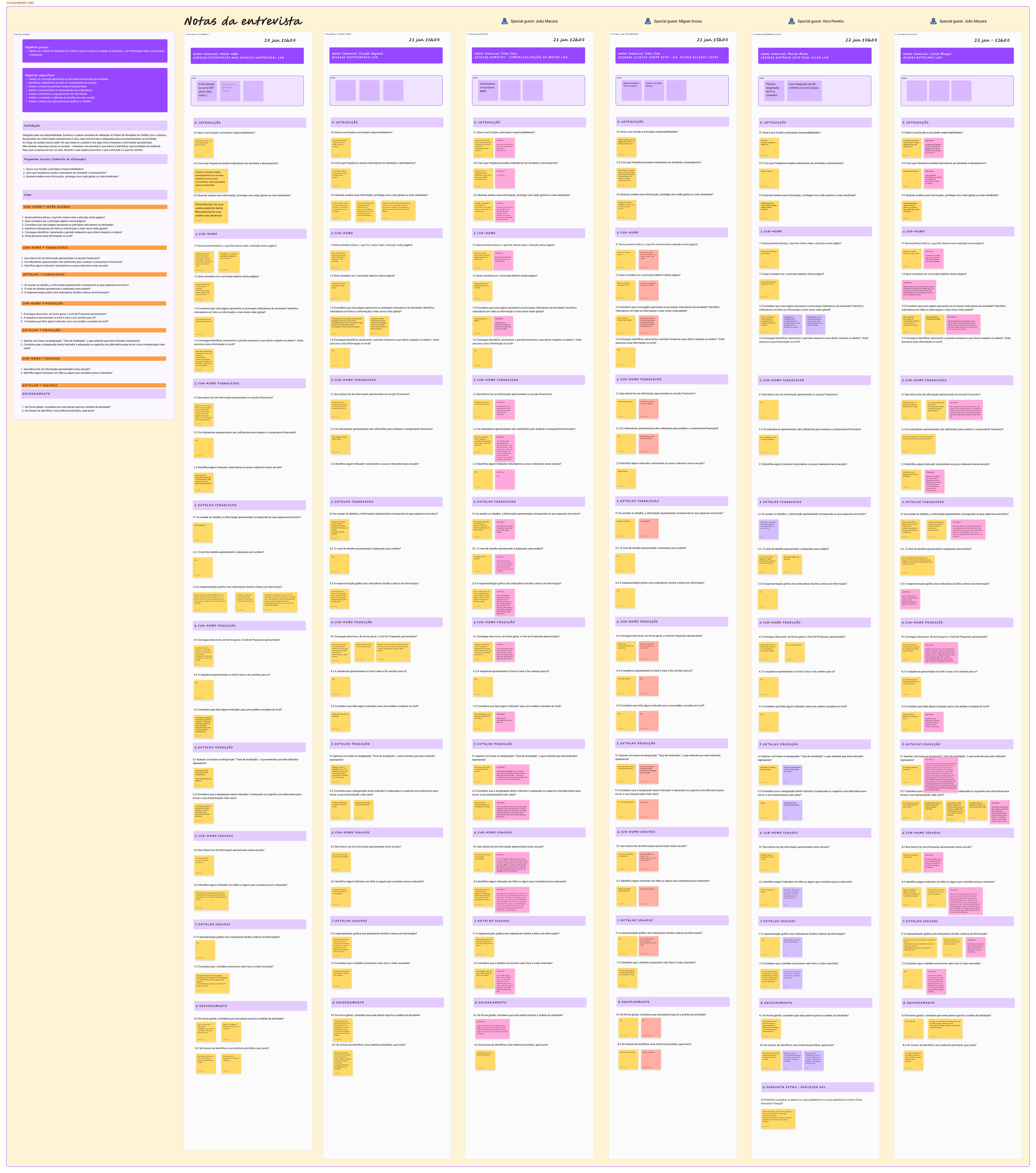
Collaborate with Product Managers and Solution Architects from all involved products to identify implementable solutions. Conduct research and interview partners to map and design workflows.
S
The Solution
Enable a single login with profile management, ensuring information is routed to the appropriate sites. Provide intuitive search filters for easy export/import and real-time activity tracking.
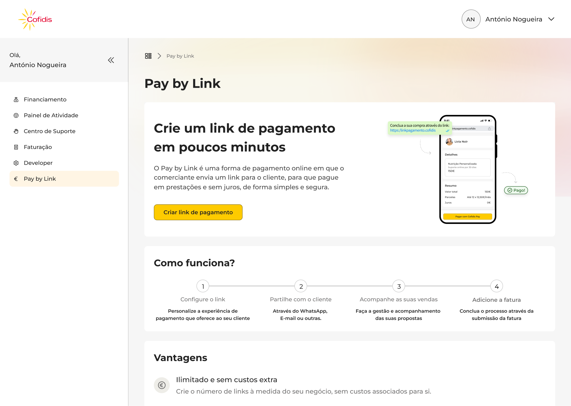
Proposal Return Flow
In a B2B financing system, returning a proposal is a rare but financially critical task. Users need confidence, clarity, and full control—any mistake can directly affect amounts, revenue, and relationships with end customers.
This flow was designed to provide a secure and intuitive return experience, without overwhelming users with unnecessary complexity.
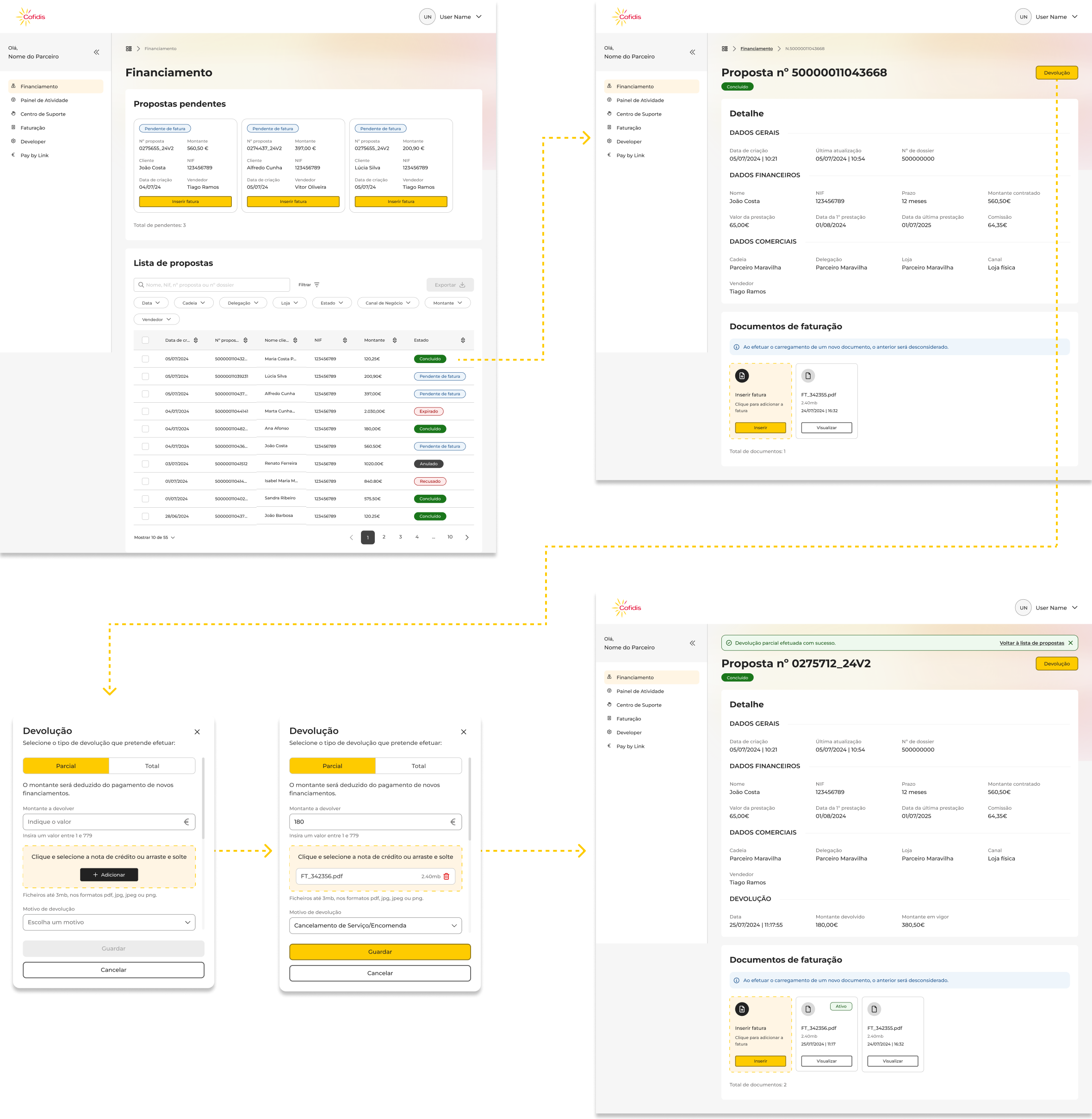
UI Decisions
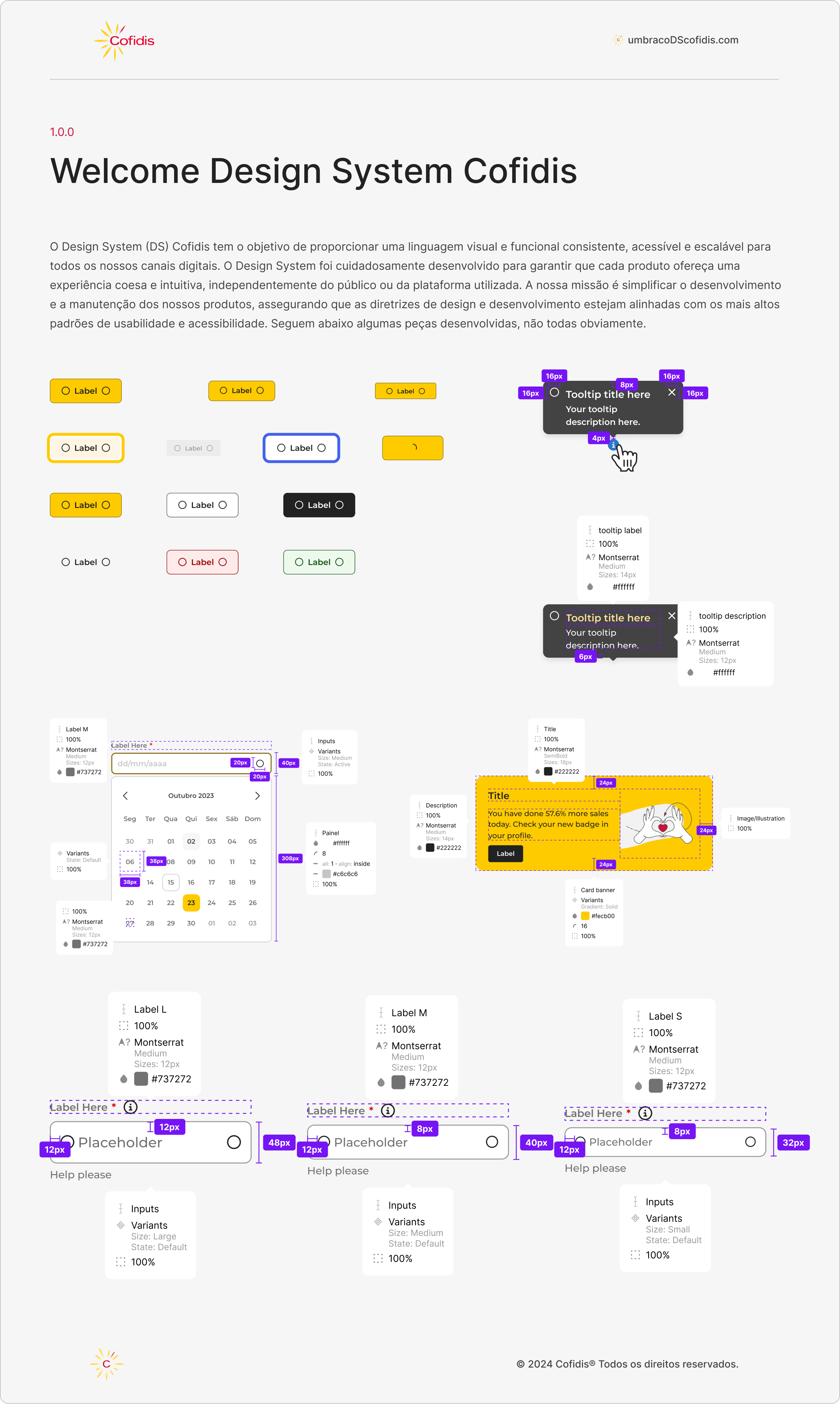
UI decisions are based on a strong visual hierarchy aligned with the Design System, clearly distinguishing financial, commercial, and operational data. States and colors are applied consistently to communicate progress and action status, reducing ambiguity throughout the flow.
Reusable components—such as tables, popups, uploads, and badges—ensure coherence across the platform and reinforce interface predictability.
The experience is intentionally designed to prioritize focus and precision over speed, reflecting the critical nature of the process.
Impact
This flow transforms proposal returns from an opaque, error-prone process into a controlled, clear, and secure experience. Users maintain a continuous sense of control, even in critical moments, which builds trust in the system and minimizes the risk of errors.

React | Figma | Azure DevOps Server
Área Parceiro 360
I joined Cofidis with the mission of contributing to one of the brand’s largest projects: Área Parceiro 360. This product is part of the B2B digital ecosystem, designed to streamline and optimize interactions with our partners.
Área Parceiro 360 brings together multiple products, resources, and content in a single platform, aiming to enhance the user experience, increase partner autonomy, and boost internal efficiency.
G
The Goal
Centralizing multiple products into a single platform, bringing features and content together in one place to improve user experience, increase partner autonomy, and boost internal efficiency.
P
The Problem
Information was confusing and scattered, with a high risk of errors in irreversible actions. Micro-actions were impossible to support due to differing rules and manual processes that relied on human validation.
I
Initial Approach
Collaborate with Product Managers and Solution Architects from all involved products to identify implementable solutions. Conduct research and interview partners to map and design workflows.
S
The Solution
Enable a single login with profile management, ensuring information is routed to the appropriate sites. Provide intuitive search filters for easy export/import and real-time activity tracking.
Proposal Return Flow
In a B2B financing system, returning a proposal is a rare but financially critical task. Users need confidence, clarity, and full control—any mistake can directly affect amounts, revenue, and relationships with end customers.
This flow was designed to provide a secure and intuitive return experience, without overwhelming users with unnecessary complexity.
UI Decisions
UI decisions are based on a strong visual hierarchy aligned with the Design System, clearly distinguishing financial, commercial, and operational data. States and colors are applied consistently to communicate progress and action status, reducing ambiguity throughout the flow.
Reusable components—such as tables, popups, uploads, and badges—ensure coherence across the platform and reinforce interface predictability.
The experience is intentionally designed to prioritize focus and precision over speed, reflecting the critical nature of the process.
Impact
This flow transforms proposal returns from an opaque, error-prone process into a controlled, clear, and secure experience. Users maintain a continuous sense of control, even in critical moments, which builds trust in the system and minimizes the risk of errors.